Hasta el día 5 de febrero la ciudad se llena de propuestas relacionadas con el diseño.
Es la Valencia Disseny Week.
Until the 5th of February the city is filled with related proposals with the design.
It's Valencia Disseny Week.
Diferentes tipos de charlas, exposiciones, eventos con diseñadores, presentaciones de revistas y muchas otras opciones crean una agenda bien repleta para no perderse las últimas tendencias en el mundo del diseño.
Para que tengáis una idea más completa, podéis consultar aquí el programa al completo.
¡Feliz semana del diseño!
Different types of talks, exhibitions, events with designers, presentations of magazines and many other options create a well full agenda to not lost the last trends in the world of design.
So that you have a more complete idea, you can consult the full program here.
Happy week of the design!
Mostrando entradas con la etiqueta design. Mostrar todas las entradas
miércoles, 3 de febrero de 2016
martes, 22 de diciembre de 2015
"La Fantástica guía de Russafa"
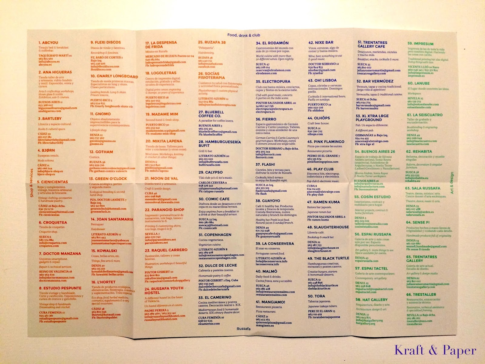
Como apasionado del papel, la vista se me escapa cada vez que veo algo confeccionado con este material. Paseaba esta tarde cuando he visto un mapa/guía que no he podido evitar coger y que comparto con vosotros: "La Fantástica guiña de Russafa". El color azul y la tipografía naranja han atrapado mi interés desde el primer minuto.
As passionate about the paper, the view is beyond me every time I see something made with this material. I was walking this afternoon when I saw a map/guide that I could not avoid catching and I share with you: "The Fantastic Russafa guide." The blue and orange typography have caught my interest from the first minute.
Como toda guía, conforme vas desplegando el mapa, aparece el plano del barrio y el listado de lugares donde comprar, comer y beber o disfrutar del arte y la cultura de sus calles.
*Una nota: su nombre, Russafa, parece que tiene el origen en los jardines de recreo de un palacio árabe del siglo IX. Deriva de la palabra árabe que significa precisamente eso, 'jardín'.
En cualquier caso, lo que está claro es que es un barrio renacido, en el que perderse y disfrutar de todo lo bueno que puede ofrecer. Con esta guía, seguro que es fácil encontrarlo.
Este proyecto ha sido creado por Gnomo y Villamerienda y diseñado en El Chiringuito, estudio de diseño gráfico e interiorismo (Carlos Cervera 13, bajo izq.)
Like any guide, as you go displaying the map, the map of the neighborhood and the list of places to shop, eat and drink or enjoy the art and culture of the streets appears.
*A note: The name, Russafa, seems to have originated in the pleasure gardens of a ninth-century Arab palace. Derived from the Arabic word that means just that, 'garden'.
In any case, what is clear is that is a reborn neighborhood to get lost and enjoy all the good that can offer. With this guide, it sure is easy to find.
This project has been created by Gnomo and Villamerienda , and designed in El Chiringuito, graphic design studio and interior (Carlos Cervera 13 under left.)
As passionate about the paper, the view is beyond me every time I see something made with this material. I was walking this afternoon when I saw a map/guide that I could not avoid catching and I share with you: "The Fantastic Russafa guide." The blue and orange typography have caught my interest from the first minute.
Como toda guía, conforme vas desplegando el mapa, aparece el plano del barrio y el listado de lugares donde comprar, comer y beber o disfrutar del arte y la cultura de sus calles.
*Una nota: su nombre, Russafa, parece que tiene el origen en los jardines de recreo de un palacio árabe del siglo IX. Deriva de la palabra árabe que significa precisamente eso, 'jardín'.
En cualquier caso, lo que está claro es que es un barrio renacido, en el que perderse y disfrutar de todo lo bueno que puede ofrecer. Con esta guía, seguro que es fácil encontrarlo.
Este proyecto ha sido creado por Gnomo y Villamerienda y diseñado en El Chiringuito, estudio de diseño gráfico e interiorismo (Carlos Cervera 13, bajo izq.)
Like any guide, as you go displaying the map, the map of the neighborhood and the list of places to shop, eat and drink or enjoy the art and culture of the streets appears.
*A note: The name, Russafa, seems to have originated in the pleasure gardens of a ninth-century Arab palace. Derived from the Arabic word that means just that, 'garden'.
In any case, what is clear is that is a reborn neighborhood to get lost and enjoy all the good that can offer. With this guide, it sure is easy to find.
This project has been created by Gnomo and Villamerienda , and designed in El Chiringuito, graphic design studio and interior (Carlos Cervera 13 under left.)
miércoles, 22 de octubre de 2014
Una mini página de otoño | An autumn's mini-layout
Hoy, aprovechando la inspiración otoñal, cómo realzar una única foto utilizando diferentes materiales. Para ello, además de la fotografía y unos cuantos papeles que combinen, he utilizado unas letras adhesivas, una bolsa de papel kraft, una hoja de Quercus (o Roble) y un poco de fibra de madera (la podéis encontrar en la frutería protegiendo las granadas) También he incluido unas pequeñas maderas, muy fina, de una caja de un pan que compré hace unos días. ¿Quién dijo miedo? Hoy, combinamos materiales.
Today, making use of the fall inspiration, I write one post about how to enhance just a photo, using different materials. For that, besides the photograph and some papers that combine, I have used some adhesive letters, one envelope-bag of kraft paper, a leaf of Quercus (or Oak) and a bit of wood fibre (you can find it in the fruit store protecting the pomegranates) Also, I've included some small woods, very fine, of a box of a bread that I bought some days ago. Who said fear? Today, we combine materials.
La idea es sencilla, ya que simplemente he ido superponiendo capas de diferentes materiales. En este caso sólo he utilizado la tinta color café para matizar algunos bordes del papel. El sobre de papel kraft lo he plegado, para darle relieve al conjunto. Y con la cinta adhesiva de doble cara, se van pegando las diferentes capas de materiales para crear el conjunto.
The idea is simple, I have superposed layers of different materials. In this case I have only used the coffee color ink to change some edges of the paper. I've folded the envelope of kraft paper, to give relief to the set. And with the adhesive tape of double side, the different material layers keep sticking to create the set.
Lo último ha sido utilizar el abecedario adhesivo y un rotulador de tinta blanca para escribir los conceptos que me recuerdan esta foto: "naturaleza, bosque, setas, Pirineos, hojas... es otoño"
The last step has been to use the adhesive alphabet and a pen of white ink to write the concepts that remind me of this photo: "nature, forest, mushrooms, Pyrenees, leaves... it's fall"
Today, making use of the fall inspiration, I write one post about how to enhance just a photo, using different materials. For that, besides the photograph and some papers that combine, I have used some adhesive letters, one envelope-bag of kraft paper, a leaf of Quercus (or Oak) and a bit of wood fibre (you can find it in the fruit store protecting the pomegranates) Also, I've included some small woods, very fine, of a box of a bread that I bought some days ago. Who said fear? Today, we combine materials.
La idea es sencilla, ya que simplemente he ido superponiendo capas de diferentes materiales. En este caso sólo he utilizado la tinta color café para matizar algunos bordes del papel. El sobre de papel kraft lo he plegado, para darle relieve al conjunto. Y con la cinta adhesiva de doble cara, se van pegando las diferentes capas de materiales para crear el conjunto.
The idea is simple, I have superposed layers of different materials. In this case I have only used the coffee color ink to change some edges of the paper. I've folded the envelope of kraft paper, to give relief to the set. And with the adhesive tape of double side, the different material layers keep sticking to create the set.
Lo último ha sido utilizar el abecedario adhesivo y un rotulador de tinta blanca para escribir los conceptos que me recuerdan esta foto: "naturaleza, bosque, setas, Pirineos, hojas... es otoño"
The last step has been to use the adhesive alphabet and a pen of white ink to write the concepts that remind me of this photo: "nature, forest, mushrooms, Pyrenees, leaves... it's fall"
martes, 21 de octubre de 2014
Noruega rediseña sus billetes | Norway redesigns it's banknotes
Los Noruegos lo han vuelto a hacer. En este caso, con sus billetes. El Banco de Noruega convocó un concurso para decidir cuáles serían los nuevos diseños que lucirán los billetes a partir de 2017. La idea era poder representar el mar como concepto en los nuevos papeles-moneda.
En una decisión inesperada, el jurado determinó que escogería un diseño diferente para el reverso y otro para el anverso.
Así, los ganadores para el anverso fue The Metric System con su serie "Espacios vitales" (The living spaces).
The Norwegians have made it again. In this case, with their banknotes. The Bank of Norway called for a competition to decide which would be the new designs that will exhibit the banknotes from 2017. The idea was to be able to represent the sea as concept in the new notes.
In an unexpected decision, the jury determined that would choose a different design for the back and another for the obverse.
Thus, the winners for the obverse sive was The Metric System with their series "The living spaces".
As the Bank says, the design of The Metric System is clear and typically nordic. Perhaps they are approached more to the classic styles of the European notes, a little more conservative.
On the other hand, in the case of the back side , the selected team were Snøhetta with their design "The Beauty of Boundaries". The design is opposed the previous one: much more avant-garde and more transgressive if we take the traditional parameters that appear in the notes of the countries.
In this case, the pixels of the notes have relationship with the value that they represent. Besides integrating the subject of the competitions (the sea) relates it with the Beaufort Scale of the winds. Beaufort was an Irish who created a scale that allows measuring the intensity of the wind basing on the force of the wind, the waves and the state of sea. Then, this scale has determined the pixelación of the notes, as it can be appreciated in this image when joining the different notes (from smaller to bigger value, from left to right):
En las siguientes imágenes podréis observar los diseño al completo, de los dos ganadores.
In the following images you will be able to observe I design them in full, of both winners.
En una época en que cada vez se usa más el dinero de plástico, la decisión de crear un concurso para rediseñar los billetes permite abrir acercar el diseño atractivo a todos los ciudadanos. Una buena combinación de tradición y vanguardia, expresado en uno de los papeles que más habitualmente hacemos servir.
Sin duda, se trata de una propuesta diferente, innovadora y atrevida para los billetes de Noruega.
In a moment when the plastic money is used more, the decision of creating a competition to redesign the banknotes allows opening to bring the attractive design to all the citizens. A good combination of tradition and vanguard, expressed in one of the papers that we more usually use.
Undoubtedly, it is a different, innovative and daring proposal for the notes of Norway.
En una decisión inesperada, el jurado determinó que escogería un diseño diferente para el reverso y otro para el anverso.
Así, los ganadores para el anverso fue The Metric System con su serie "Espacios vitales" (The living spaces).
The Norwegians have made it again. In this case, with their banknotes. The Bank of Norway called for a competition to decide which would be the new designs that will exhibit the banknotes from 2017. The idea was to be able to represent the sea as concept in the new notes.
In an unexpected decision, the jury determined that would choose a different design for the back and another for the obverse.
Thus, the winners for the obverse sive was The Metric System with their series "The living spaces".
(imagen)
Tal y como destaca el propio Banco, el diseño de The Metric System es claro y típicamente nórdico. Quizás se acercan más a los estilos clásicos de los billetes europeos, algo más conservador.
Por contra, en el caso del reverso, los seleccionados fueron el equipo de Snøhetta con su diseño "La belleza de los límites" (The Beauty of Boundaries). El diseño es opuesto al anterior: mucho más vanguardista y transgresor si tenemos en cuenta los parámetros tradicionales que se manifiestan en los billetes de los países. As the Bank says, the design of The Metric System is clear and typically nordic. Perhaps they are approached more to the classic styles of the European notes, a little more conservative.
On the other hand, in the case of the back side , the selected team were Snøhetta with their design "The Beauty of Boundaries". The design is opposed the previous one: much more avant-garde and more transgressive if we take the traditional parameters that appear in the notes of the countries.
(imagen)
En este caso, los píxeles de los billetes tienen relación con el valor que representan. Además de integrar la temática del concursos (el mar) lo relaciona con la Escala de Beaufort de la Fuerza de los vientos. Beaufort fue un irlandés que creó una escala que permite medir la intensidad del viento basándose en la fuerza del viento, el oleaje y el estado del mar. Pues esta escala ha determinado la pixelación de los billetes, como se puede apreciar en esta imagen al unir los diferentes billetes (de menor a mayor valor, de izquierda a derecha):In this case, the pixels of the notes have relationship with the value that they represent. Besides integrating the subject of the competitions (the sea) relates it with the Beaufort Scale of the winds. Beaufort was an Irish who created a scale that allows measuring the intensity of the wind basing on the force of the wind, the waves and the state of sea. Then, this scale has determined the pixelación of the notes, as it can be appreciated in this image when joining the different notes (from smaller to bigger value, from left to right):
(imagen)
En las siguientes imágenes podréis observar los diseño al completo, de los dos ganadores.
In the following images you will be able to observe I design them in full, of both winners.
THE METRIC SYSTEM
SNØHETTA
(imágenes vía Snøhetta)
En una época en que cada vez se usa más el dinero de plástico, la decisión de crear un concurso para rediseñar los billetes permite abrir acercar el diseño atractivo a todos los ciudadanos. Una buena combinación de tradición y vanguardia, expresado en uno de los papeles que más habitualmente hacemos servir.
Sin duda, se trata de una propuesta diferente, innovadora y atrevida para los billetes de Noruega.
In a moment when the plastic money is used more, the decision of creating a competition to redesign the banknotes allows opening to bring the attractive design to all the citizens. A good combination of tradition and vanguard, expressed in one of the papers that we more usually use.
Undoubtedly, it is a different, innovative and daring proposal for the notes of Norway.
sábado, 12 de julio de 2014
Artista del día: Yoshi Sislay | Artist of the day: Yoshi Sislay
Tuve la oportunidad de descubrir la obra de Yoshi Sislay en la ala Vinçon en otoño de 2011. Desde entonces, reconozco que soy fan de su trabajo.
I had the opportunity to discover the work of Yoshi Sislay in the Sala Vinçon in the autumn of 2011. Since then, I have to admit I'm a fan of his work.
Yoshi es un japonés nacido en Osaka. Después de haber viajado por más de 30 países, decidió establecerse en Barcelona en 2005, donde tiene su taller artístico.
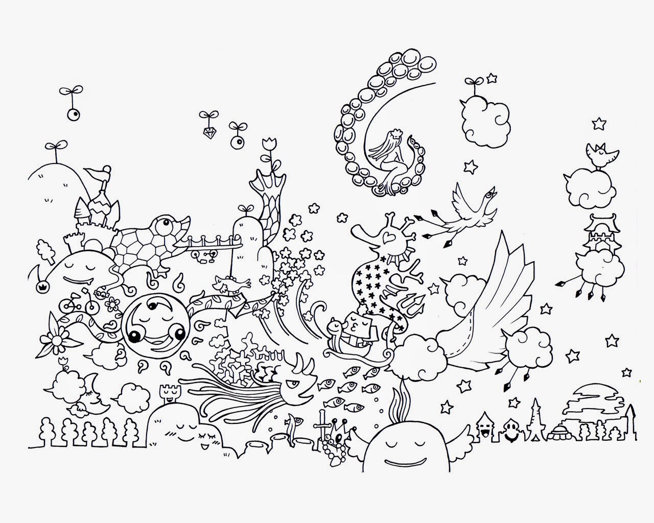
El trabajo de Yoshi sislay tiene un aspecto aparentemente sencillo, casi infantil (por el tipo de trazo) pero de enorme imaginación y una importante carga de paciencia.
Yoshi is a Japanese born in Osaka. After traveling to more than 30 countries, decided to base in Barcelona in 2005, where he has his art studio.
Yoshi Sislay's work has a seemingly simple, almost childlike (by type of drawing line) but of enormous imagination and a heavy load of patience.
En la Sala Vinçon, por ejemplo, pintó todas las paredes con sus dibujos, hechos íntegramente a mano!
Su mundo imaginario está lleno de pequeñas criaturas animadas, felices. Es imprescindible dedicar mucho tiempo para contemplar su trabajo por el elevado nivel de detalle que hay en cada dibujo.
I had the opportunity to discover the work of Yoshi Sislay in the Sala Vinçon in the autumn of 2011. Since then, I have to admit I'm a fan of his work.
(foto)
Yoshi es un japonés nacido en Osaka. Después de haber viajado por más de 30 países, decidió establecerse en Barcelona en 2005, donde tiene su taller artístico.
El trabajo de Yoshi sislay tiene un aspecto aparentemente sencillo, casi infantil (por el tipo de trazo) pero de enorme imaginación y una importante carga de paciencia.
Yoshi is a Japanese born in Osaka. After traveling to more than 30 countries, decided to base in Barcelona in 2005, where he has his art studio.
Yoshi Sislay's work has a seemingly simple, almost childlike (by type of drawing line) but of enormous imagination and a heavy load of patience.
En la Sala Vinçon, por ejemplo, pintó todas las paredes con sus dibujos, hechos íntegramente a mano!
Su mundo imaginario está lleno de pequeñas criaturas animadas, felices. Es imprescindible dedicar mucho tiempo para contemplar su trabajo por el elevado nivel de detalle que hay en cada dibujo.
(foto)
(foto)
(foto)
jueves, 12 de junio de 2014
Eskenazi
Convivo con sus diseños: cuando cojo el metro, cuando entro en un restaruante o frente a alguna entidad bancaria. Está en la calle, en el tiquet turístico que compras cuando visitas Barcelona o en los camiones encargados de limpiar las calles de la ciudad.
Él es Mario Eskenazi.
Mario Eskenazi es responsable de los diseños de, entre otros, Transportes Metropolitanos de Barcelona, Banco Sabadell o los restaurantes del Grupo Tragaluz.
Hoy os presento algunos de sus trabajos, los que más em gustan: la identidad de la tienda Santa Eulàlia, la que realizó con motivo de la exposición sobre Ferran Adrià y el Bulli, la del restaurante La Xina o la del Roca Moo.
Fue Premio Nacional de Diseño en el año 2000, y como podéis comprobar, todo su trabajo tiene un fuerte impacto. Es directo, honesto y claro. Un diseño que habla por sí solo.
Todas las imágenes son de su propia web.
Mario Eskenazi is responsible for the design of, among others, Transports Metropolitans de Barcelona, Banco Sabadell or restaurants of Tragaluz Group.
Today I present some of his work, the more I like: the identity of the store Santa Eulàlia, the identity that made for the exhibition on Ferran Adrià and El Bulli, or for the restaurant La Xina o Roca Moo.
He won the National Design Award in 2000, and as you can see, all his work has a strong impact. He is direct, honest and clear. A design that speaks for itself.
All images are from your own site.
Él es Mario Eskenazi.
I live with his designs: when I take the subway, when I enter a restaruante or any bank. It's in the street, in the tourist ticket you buy when you visit Barcelona or on the trucks who clean the city streets.
He is Mario Eskenazi.
(fotografía de Gràffica)
Hoy os presento algunos de sus trabajos, los que más em gustan: la identidad de la tienda Santa Eulàlia, la que realizó con motivo de la exposición sobre Ferran Adrià y el Bulli, la del restaurante La Xina o la del Roca Moo.
Fue Premio Nacional de Diseño en el año 2000, y como podéis comprobar, todo su trabajo tiene un fuerte impacto. Es directo, honesto y claro. Un diseño que habla por sí solo.
Todas las imágenes son de su propia web.
Mario Eskenazi is responsible for the design of, among others, Transports Metropolitans de Barcelona, Banco Sabadell or restaurants of Tragaluz Group.
Today I present some of his work, the more I like: the identity of the store Santa Eulàlia, the identity that made for the exhibition on Ferran Adrià and El Bulli, or for the restaurant La Xina o Roca Moo.
He won the National Design Award in 2000, and as you can see, all his work has a strong impact. He is direct, honest and clear. A design that speaks for itself.
All images are from your own site.
Suscribirse a:
Entradas (Atom)