Sigue a K&P || Follow K&P

lunes, 11 de agosto de 2014

Regalos con kraft | Gifts with kraft

Cuando hacemos un regalo a alguien, la muestra de cariño viene tanto por el propio regalo como por la envoltura, la presentación que hacemos. Esto demuestra el tiempo que hemos dedicado a esa persona, a buscar la manera de sorprenderle desde el momento en que le entregamos el regalo.

When we make a gift to somebody, our affection exhibition comes for the gift itself as well as for the cover, the presentation that we do. This proves the time that we have dedicated to that person, to look for the way of surprising him since the moment in which we deliver the gift to him or her. 

Aquí van 7 ideas sencillas y efectivas para envolver regalos con papel kraft:

Here you have 7 simple and effective ideas to wrap gifts with kraft paper:

1. http://vintageluxe.tumblr.com/post/14403816931/photographer-michael-graydon 

2. http://linprobable.tumblr.com/post/67877849317

3. http://www.pinterest.com/pin/449726712760760573/

4. http://www.duitang.com/people/mblog/14824371/detail/

5. http://www.byzenz.nl/a-29960118/stickers/stickers-ster-zwart/
5. 

6. http://www.pinterest.com/pin/567383253027579850/

7. http://www.artifactuprisingblog.com/inspired-design/diy-gift-wrapping-the-au-way/


viernes, 18 de julio de 2014

Es verano, es amarillo | It's summer, it's yellow

Verano es la estación del año que mejor queda representada por el color amarillo. Hay
personas que no les gusta, otras le tienen manía o no aciertan con la combinación de colores.
Pero el amarillo puede ser un color elegante y divertido, combinado con grises o blancos; como podréis descubrir en estas 7 propuestas de papelería con el color amarillo como portagonista.
¡Espero que os inspire para el fin de semana!

Summer is the season that is best represented by the color yellow. Some people do not like, other people will not know or have craze for matching the color combination.
But yellow can be an elegant and fun color, combined with gray or white; as you will discover in these seven proposals of stationery with yellow as the protagonist.
I hope you inspire for the weekend!


(foto 1)

(foto 2)

 (foto 3)

(foto 4)

(foto 5)


 (foto 6)


 (foto 7)

sábado, 12 de julio de 2014

Artista del día: Yoshi Sislay | Artist of the day: Yoshi Sislay

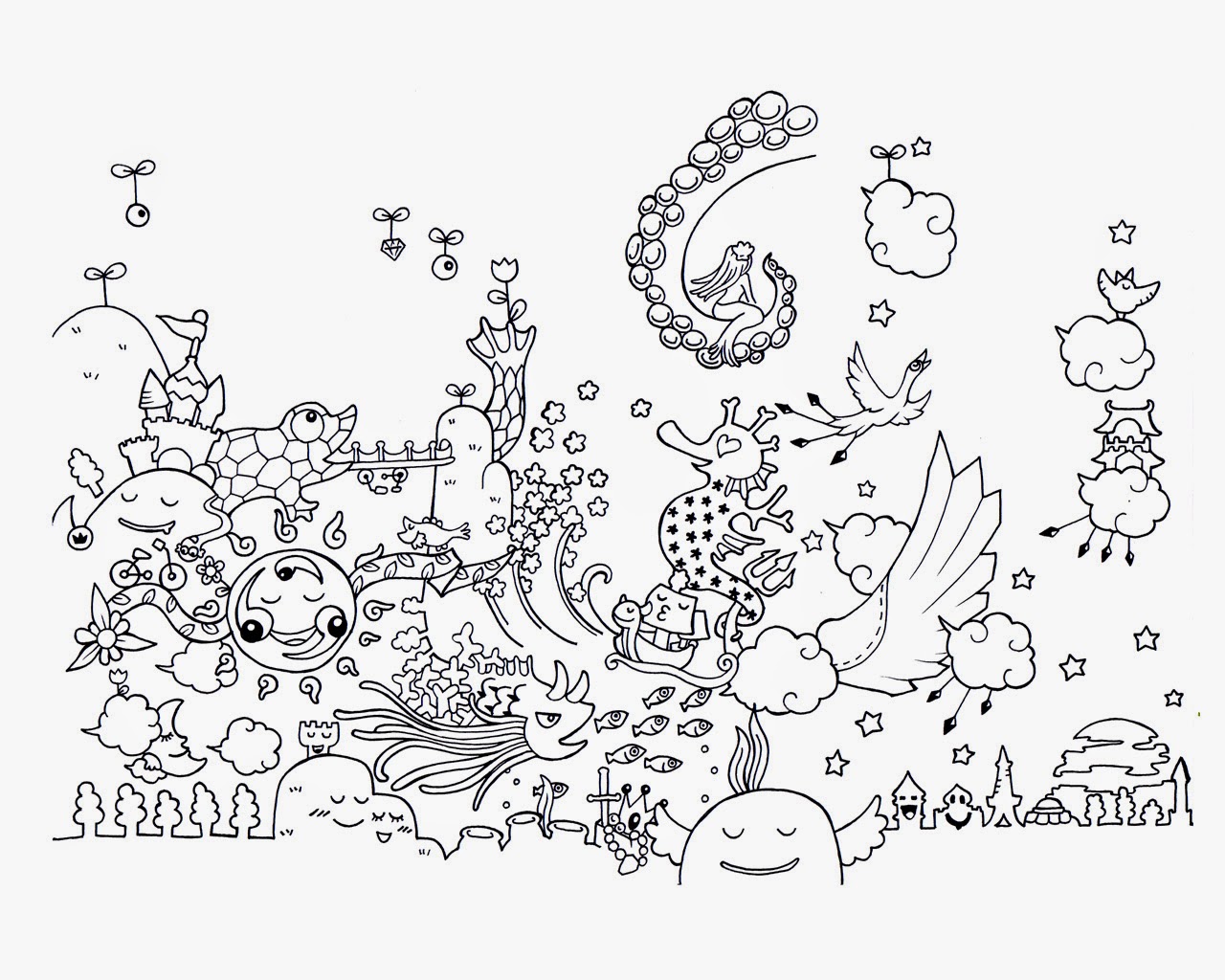
Tuve la oportunidad de descubrir la obra de Yoshi Sislay en la ala Vinçon  en otoño de 2011. Desde entonces, reconozco que soy fan de su trabajo.
I had the opportunity to discover the work of Yoshi Sislay in the Sala Vinçon in the autumn of 2011. Since then, I have to admit I'm a fan of his work.


(foto)

Yoshi es un japonés nacido en Osaka. Después de haber viajado por más de 30 países, decidió establecerse en Barcelona en 2005, donde tiene su taller artístico.
El trabajo de Yoshi sislay tiene un aspecto aparentemente sencillo, casi infantil (por el tipo de trazo) pero de enorme imaginación y una importante carga de paciencia.
Yoshi is a Japanese born in Osaka. After traveling to more than 30 countries, decided to base in Barcelona in 2005, where he has his art studio.
Yoshi Sislay's work has a seemingly simple, almost childlike (by type of drawing line) but of enormous imagination and a heavy load of patience.


En la Sala Vinçon, por ejemplo, pintó todas las paredes  con sus dibujos, hechos íntegramente a mano!
Su mundo imaginario está lleno de pequeñas criaturas animadas, felices. Es imprescindible dedicar mucho tiempo para contemplar su trabajo por el elevado nivel de detalle que hay en cada dibujo.


(foto)

(foto)

(foto)


*No olvidéis que Kraft&Paper está también en Twitter, Pinterest & Instagram 
*Do not forget that Kraft&Paper is also on Twitter, Pinterest & Instagram

jueves, 10 de julio de 2014

"The Fox's Den" by Zim&Zou | "La Madriguera del zorro" por Zim&Zou

En general, en la ciudad en la que vivo puedo disfrutar de buenos escaparates, cuidados y atractivos. Los escaparates de Hermès siempre me gustan. Y el que hoy muestro especialmente, pues prácticamente en su totalidad está realizado con papel (excepto el zorro, que está hecho íntegramente en cuero)
Los artistas son Lucie Thomas y Thibault Zimmermann, o lo que es lo mismo: Zim & Zou. Un estudio de diseño francés que explora todas la posibilidades que ofrece el papel como material, así como la ilustración y las instalaciones.

In general, in the city where I live, I can enjoy good shopwindows well made and attractive. I always like the shopwindows of Hermès. And the shopwindow that show today especially, because it's almost entirely made ​​with paper (except the fox, which is made entirely of leather)
Artists are Lucie Thomas and Thibault Zimmermann, or what is the same: Zim & Zou. A French design studio that explores all the possibilities offered by the paper as material, as well as illustration and installations

.

En esta ocasión, Hermés nos cuenta la historia de un zorro, que se ha mudado al escaparate y allí está, mostrando su decorada madriguera y su personalidad de gentleman. Se trata de un zorro hecho con cuero, viviendo en un entorno humano con muebles de papel.
¡¡¡Todas las piezas del escaparate has sido hechas a mano!!!
Las imágenes de esta entrada están integramente extraídas de la web de Zim&Zou.

This time, Hermes tells the story of a fox, who has moved to the shopwindow and there it is, showing his decorated den and showing his true personality gentleman.  
It's a fox made ​​with leather, living in a human environment with paper furniture. All pieces showcase has been handmade!!!
All the images in this post are from Zim & Zou website.


lunes, 30 de junio de 2014

DIY: Azul parisino | DIY: Parisienne blue

Desde siempre, la estética francesa y todo lo relacionado con su cultura me ha atraido de una forma especial. En esta ocasión, utilizo una colección cápsula "Parisienne blue" de DoCrafts. Es una colección con unos estampados románticos, que bien podrían decorar cualquier pared de un hotel francés. La gama de colores es en azul, combinada con crema, pasteles y marinos.
Con estos papeles he elaborado unas sencillas tarjetas, pero no las habituales (en forma de díptico) sino más sencillas, con forma de etiqueta; combinando papel kraft y unos sellos de motivos típicamente parisinos. Los he rematado con un lazo en cinta azul, que destacan y rematan la tarjeta.
Para completar la colección, la sorpresa en la utilización de los papeles es que éstos se encuentran en el interior de los sobres. Éstos están realizados también en papel kraft y en su interior se encuentra el papel de DoCraft. Con ello, la persona receptora de la tarjeta descubre, al abrir el sobre, todo el color que esconde el envío.
De esta forma se pueden hacer llegar mensajes de agradecimiento, pequeñas felicitaciones u otros mensajes que queráis dar a conocer de una forma diferente y más personalizada.

Since I can remember, the French aesthetic and everything about their culture has attracted me in a special way. This time, I use a capsule collection "Parisienne blue" of DoCrafts. It is a romantic collection using prints that could decorate any wall in a French hotel. The color scheme is blue, combined with cream, pastels and marine.
With these papers I have made some simple cards, but not the usual (as diptych) but rather simple, shaped like label; combining kraft paper and some stamps typically Parisian reasons. I've finished with a tie on blue ribbon, that finish the card.
To complete the collection, the surprise in the use of paper is that these are inside the the envelopes. These are also made ​​of kraft paper in its interior the paper is DoCraft. With this, the person who received the card discover when opening the envelope, all the color which hides shipping.
In this way you can send thank you messages, Greeting Cards or other small messages you want to present a different and more personalized way.


jueves, 19 de junio de 2014

Jueves en Blanco y Negro | Black and White Thursday

Hoy hago una recopilación de algunas ideas de papel que más me han gustado para hacer invitaciones a eventos y decoraciones.
En esta ocasión, todo en dos colores: blanco y negro, para que sea adaptable a cualquier ocasión. Con esta combinación nunca fallas, puesto que con algún pequeño toque de color complementario se puede adaptar a los gustos del anfitrión. Añade alguna flor fucsia o rosa potente, o pequeños globos dorados o plateados, o anuda lazos amarillos o naranjas.
El blanco  y negro siempre funciona.

Today, I make a compilation of some ideas of paper I liked for invitations to events and decorations.
On this occasion, all in two colors: black and white, to be adaptable to any occasion. With this combination you never fail, because with a little touch of complementary color can be adapted to the tastes of the host. Add some pink fuchsia flower or powerful, or small gold or silver ballons, or orange or yellow ribbons tied. 

The black and white always works.


Créditos / Credits : 1 a 4, 5 , 6 , 7 .